- >News
- >Death Spirals, Bitcoin Tweets and More: The Five Most Shocking Graphs in Crypto
Death Spirals, Bitcoin Tweets and More: The Five Most Shocking Graphs in Crypto
For something that exists primarily as a set of numbers, it’s perhaps not surprising that you can learn much about crypto from graphs. Graphs and charts provide an immediate visualization of what a given cryptocurrency, blockchain or platform has been doing in the recent past, while they also provide hints as to where it could go in its future. It therefore stands to reason that the one thing cryptocurrency investors do most, beyond buying and selling crypto, is looking at graphs and charts.
And in the spirit of just how revealing they can be, this article examines the five most interesting graphs in crypto. It explains where they draw their data from, and also unpacks just why they’re intriguing and what they can tell us about what lies in store for the cryptocurrency market.


Bitcoin Volatility Index
One exceedingly helpful technical indicator in crypto is the Bitcoin Volatility Index (BVIN). This is a measure of how much bitcoin’s price has moved – and is likely to move – within a given period, which is usually 30 days.
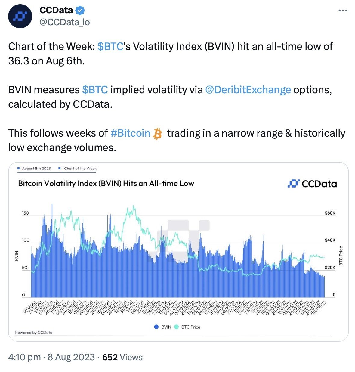
Source: Twitter
What makes the BVIN an interesting graph is that it can predict BTC rallies. As illustrated above, surges in the price of bitcoin often follow periods where the cryptocurrency’s volatility has been low. Of course, the flipside of this is that it can work both ways, with periods of low volatility also occasionally leading to drops in price.
Either way, it’s likely that periods of low volatility result in a decline in market depth and liquidity than can, in turn, result in sudden price moves. For this reason, the BVIN is definitely one graph all traders and investors should watch carefully.
Total Ethereum Staked
Ever since the Merge of September 2022, Ethereum has been a proof-of-stake blockchain. This means that its transactions are verified via a process of staking ETH on new blocks, a process which thousands, if not millions of holders are increasingly engaging in.
A number of interesting graphs can be drawn up which represent Ethereum’s new staking ecosystem, yet the one we’ve decided to focus on here is total ETH staked. As shown in the graph below, the total amount of the cryptocurrency staked has continued to rise consistently since September 2022, and has even continued to rise after withdrawals of staked ETH were enabled in April 2023.
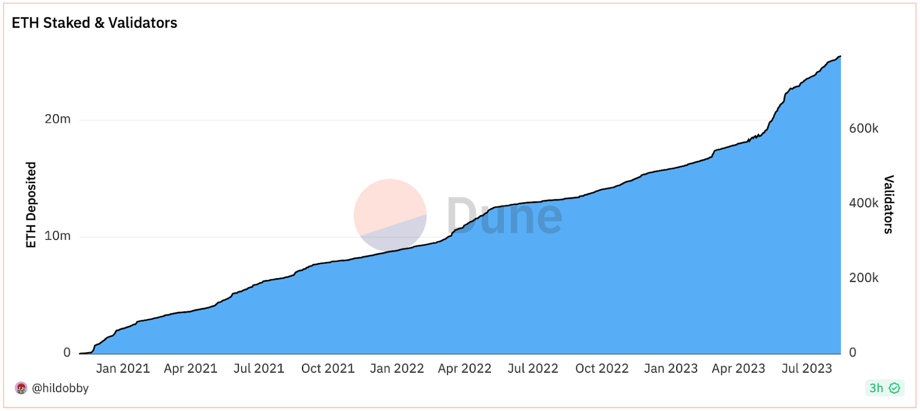
Source: Dune
In fact, the graph above reveals that the amount of staked ETH has actually risen sharply since April, even though some analysts had predicted a flood of selling once withdrawals were enabled. This indicates some very strong demand for staking ETH, with around 25 million ETH – or 21.45% of the cryptocurrency’s total supply – now locked up.
And with many other proof-of-stake blockchains having staking ratios of between 40% and 70%, much more ETH could be locked up soon enough. This means that the supply of the coin could decline sharply relative to demand, as suggested by the fact that its net supply has actually declined since September 2022. In turn, this should predict a rising ETH price over time.
Bitcoin Tweets Per Day
One interest graph in crypto is the Bitcoin Tweets Chart produced by BitInfoCharts. As its name suggests, it tracks the number of tweets posted each day that include the word ‘bitcoin.’
It provides a very useful gauge of the extent to which the general public (or at least the Twitter population) is interested in Bitcoin, as well as a picture of how interest has waxed and waned over time. And what’s encouraging about this particular graph is that it reveals how interest in Bitcoin has remained at a fairly steady level for the past few years, even with the ongoing bear market.
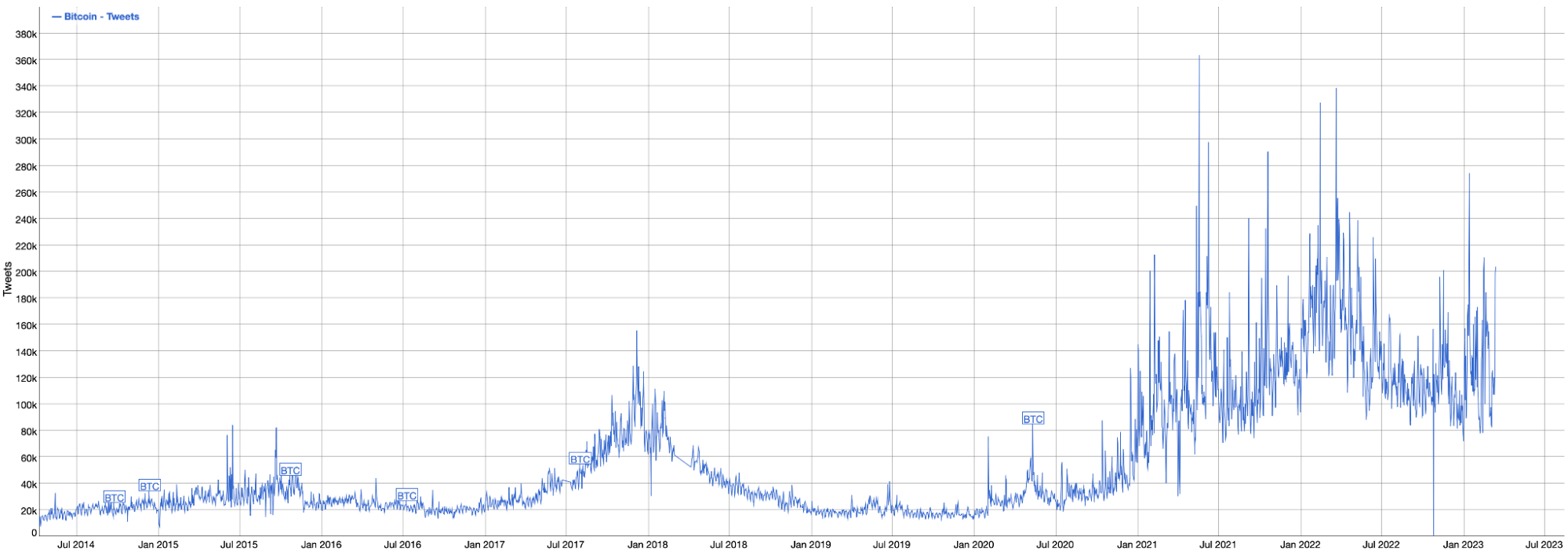
Bitcoin tweets per day (in thousands) since the middle of 2014. Source: BitInfoCharts
Indeed, the graph above shows how the current frequency of tweets per day remains above that seen during the famous bull market of late-2017/early-2018. And while it doesn’t quite match the heights of the first few months of 2022 or November 2021, it’s not far off.
If nothing else, this suggests that Bitcoin has established itself among the wider public and that, even if the cryptocurrency market continues to weather uncertainty, there is enough core interest in BTC that it could easily surge again when conditions become more favorable.
Blockchains by GitHub Commits
If there’s one graph that offers intriguing as to what crypto might look like in the future, it’s the one below. Created by CryptoMiso, this graph visualizes blockchain platforms according to the number of GitHub commits their developers have made in the past 12 months. It therefore provides insight into how much development activity a given blockchain is currently enjoying, as well as into how vigorously it could expand and evolve in the future.
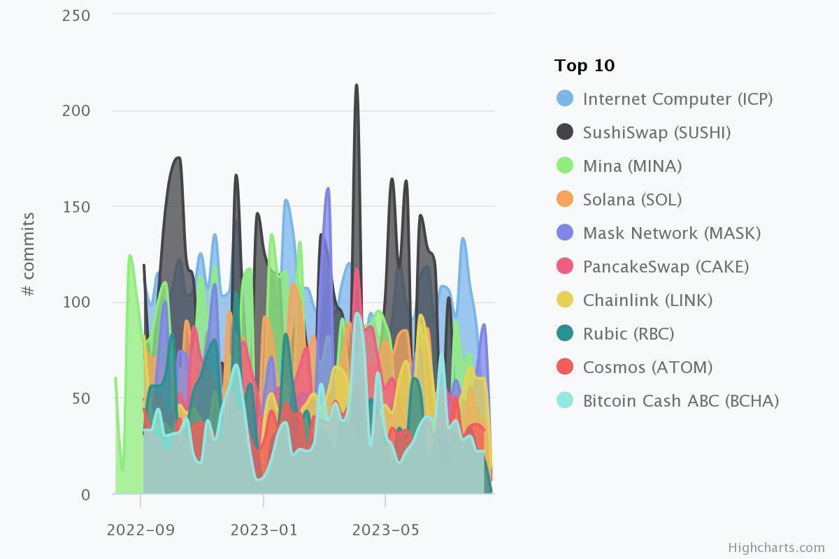
Source: CryptoMiso
As the graph above illustrates, the Internet Computer (ICP) is currently the busiest network in terms of GitHub-related development activity. It has recorded just over 5,000 GitHub commits in the past year, with its nearest two rivals – SushiSwap (SUSHI) and Mina Protocol (MINA) – at 4,700 and 3,800, respectively.
Given such activity, it could be expected that the Internet Computer may end up becoming one of the biggest platforms/cryptocurrencies in the not-too distant future. However, certain websites and analysts process GitHub data in different ways, with certain charts and graphs based on such data varying from the one above. This means investors should consider what they see carefully before jumping to any conclusions.
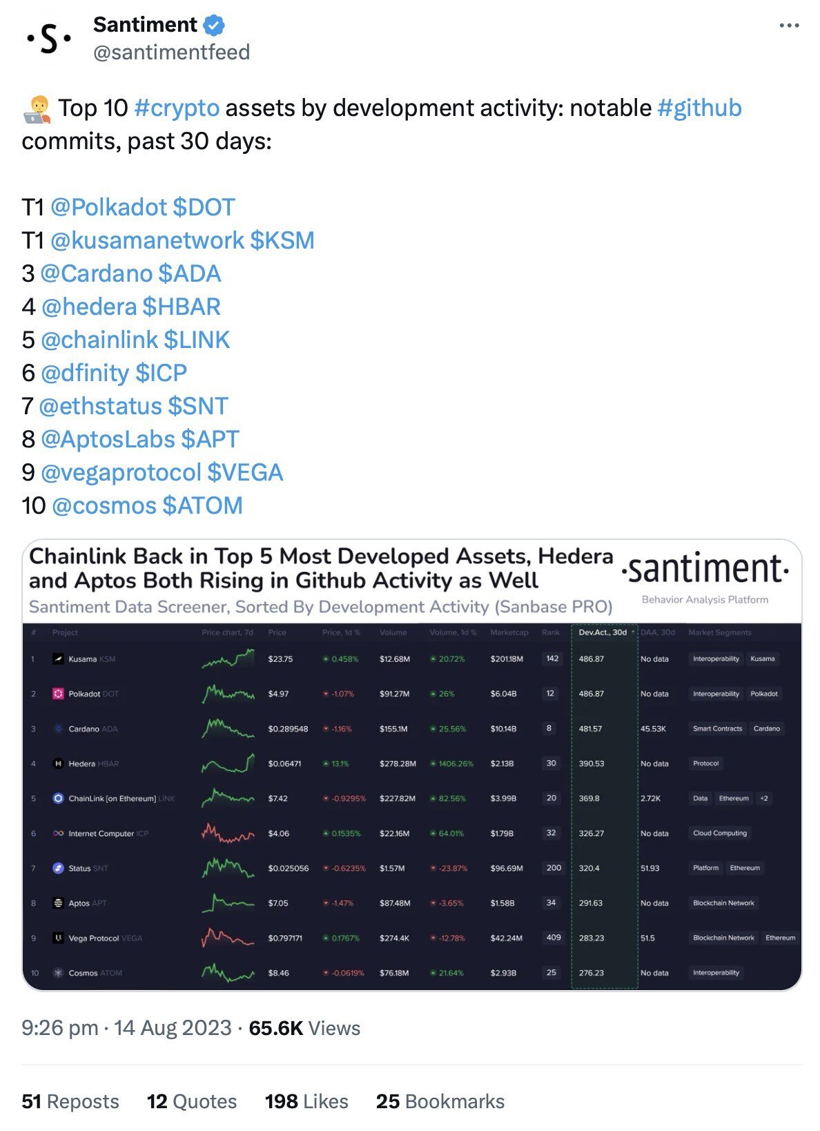
Source: Twitter/Santiment
For example, Santiment produces a similar chart based on “notable” development activity on GitHub, and within the past 30 days. Given that such a visualization focuses more on major updates than on all activity, it may be more significant than others.
Still, it’s worth pointing out that many of the same names appear in all such graphs, meaning that they do provide a helpful window into which platforms are developing the most.
Terra Luna Price Chart
Serving as a cautionary tale against the kind of overconfidence and hubris that can be all-too common in crypto, the price chart below maps out the dramatic rise and even more dramatic fall of Terra Luna (LUNA, now LUNC).
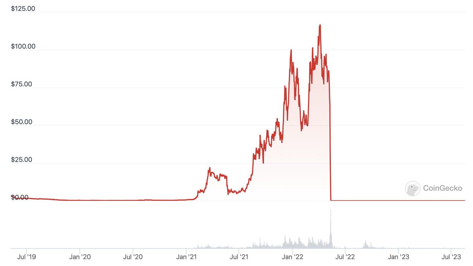
Terra Luna Classic’s price chart since June 2019. Source: CoinGecko
We could have just as easily used the price chart for TerraUSD (USTC), which was the USD-pegged stablecoin that was linked to LUNC. As an algorithmic stablecoin, USTC’s price was meant to be preserved by carefully controlling the supply of LUNC. However, May 2022 brought a catastrophic de-pegging event which resulted in over six trillion LUNC being issued in a doomed attempt to preserve LUNC’s peg.
This attempt failed, yet it had the effect of completely flooring LUNC’s price, reducing it from an all-time high of $119.18 in April 2022 to an all-time low of £0.000000999967 just over a month later. When this kind of mechanism fails it’s often referred to as a death spiral.
And while ongoing efforts are being made by the surviving Terra Luna Classic community members to restore LUNC’s price, the graph above shows very clearly that once faith in a cryptocurrency has been lost, it’s probably gone forever.

Latest News